You know when you draw something and it looks wrong? Like everything is squished onto the paper with no space between things? That’s because creating the illusion of distance is tricky. But today you can learn a few tricks, and your art will suddenly look alive. Let me show you how to make things look far away or close up, just like magic.
The Air Between Us
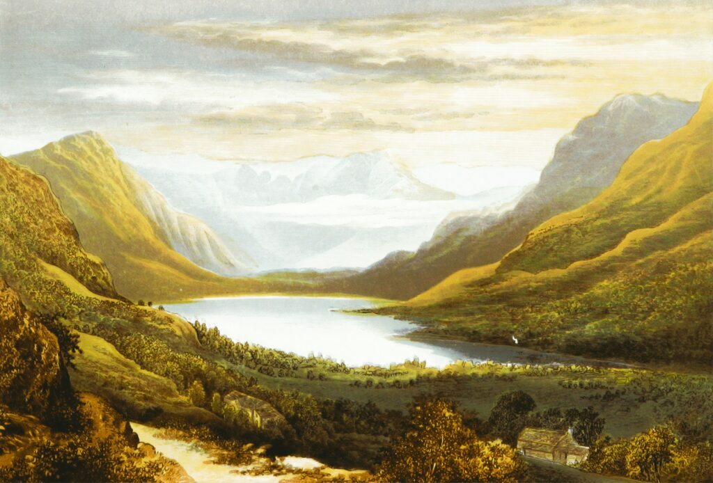
The air isn’t empty. When you look at mountains from far away, there are literally miles of air between you and the mountains. All that air changes how things look.
Things that are far away:
- Look more blue-ish
- Colors get dull and washed out
- Everything looks lighter and softer
Things that are close:
- Colors are bright and punchy
- You can see dark shadows
- Everything is clear and sharp
Think about it – a red barn right next to you is bright red. That same barn five miles away? It’s a dusty pinkish-gray color now. The air ate all that brightness.
Biggest mistake you can make is painting distant mountains with the same dark blacks as nearby trees. Don’t do that. Far away stuff should look lighter, grayer and more blue.
Lines That Trick Your Brain
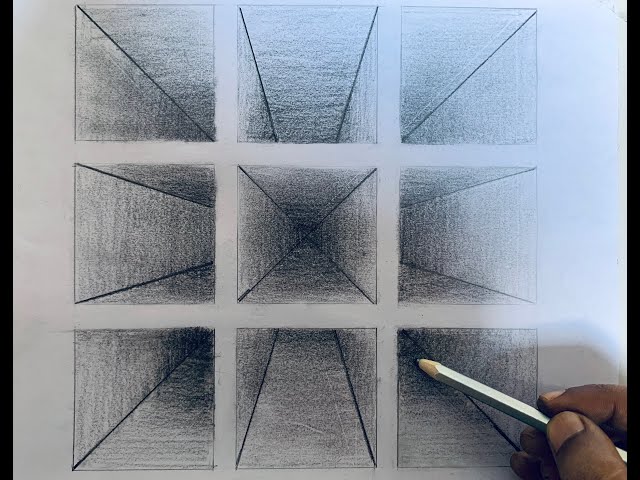
You know how train tracks seem to meet at a point far away, even though they’re actually parallel? That’s what we need to copy in our drawings.
All straight lines going into the distance should point toward the same spot on the horizon. Roads, building edges, fence lines – they all need to “agree” on where they’re going.
Also, things that repeat (like telephone poles or fence posts) should get closer together as they go back. They don’t actually get closer in real life, but on your paper, they have to.
And here’s a simple rule: stuff near the bottom of your paper looks close. Stuff near the middle (where the sky meets the ground) looks far away.
The Focus Problem
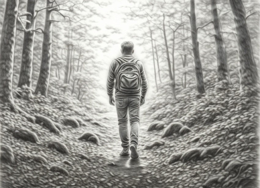
Your eyes can’t focus on everything at once. Neither can a camera. So why would your painting show everything super sharp?
Crisp, clean edges make things jump forward. Fuzzy, soft edges push things back.
If you’re painting a face of someone then the tip of their nose should be sharper than their ear. The ear can be a little blurry because it’s far from us.
Sometimes you can even let a shadow completely disappear into a dark background. This “lost edge” actually makes things feel more real, not less.
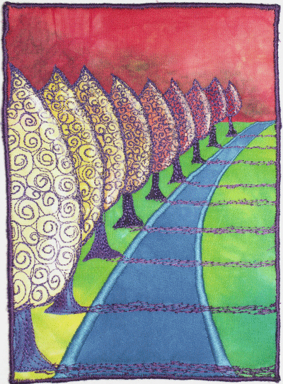
Hot and Cold Colors
Warm colors like red, orange and yellow feel like they’re jumping off the page toward you. Cool colors like blue, purple feel like they’re moving away.
So paint nearby grass with yellowy-green. Paint distant fields with blue-green.
Even if you’re painting the same thing at different distances, change the temperature of your color. A green tree up close needs yellow in it. A green tree on the horizon needs blue in it.
Big Details vs No Details
Stand outside and look at the ground near your feet. You can see every pebble, every blade of grass and every crack. Now look at a field a mile away. It’s just green. A blob of color.
That’s what you need to copy.
Paint lots of details, thick paint, individual marks in the front of your picture. In the back, use smooth washes of color with barely any detail. Just suggestions of shapes.
Up close: paint each flower petal. Far away: paint a smudge of purple that reads as “flowers.”
Layering Stuff
The easiest depth trick? Put things in front of other things.
If a tree covers part of a hill, and the hill covers part of a mountain, boom – instant depth. Our brains automatically understand the order.
Try putting something big and dark in the very front of your picture, like a tree branch hanging down. This creates a “window” effect and makes everything behind it look further away.
Professional Tricks
The squint test: Close your eyes halfway while looking at your painting. Everything gets blurry. Can you still tell what’s light and what’s dark? If your background is just as dark as the stuff in front, that’s the problem right there.
Photo trick: Snap a picture of your painting with your phone. Turn it to black and white. You’ll see right away if the back part is too dark. It needs to be lighter than the front part.
The fog trick: Painted something and it looks too close? Let it dry first. Then mix some white or light blue paint with lots of water until you can almost see through it. Brush that over the area. Boom, instant distance.
Quick Reference Guide
Let me break this down super simple:
Paint things in front with:
- Dark darks and bright lights
- Warm, strong colors
- Sharp edges
- Lots of detail
- Thick paint texture
- Big size
Paint things far away with:
- Lighter and grayer tones
- Cool and washed-out colors
- Soft and blurry edges
- Less detail
- Smooth, thin paint
- Small size
Frequently Asked Questions
Why does my landscape look flat even though I painted it exactly like the photo?
Photos lie. Cameras smash everything flat. You actually need to make things MORE different than the photo shows. Make the background even lighter and bluer than you see. Make the front even darker with more details.
How blue should distant mountains be?
Way more blue than you think. If you’re looking at your blue and thinking that’s too much then it’s probably perfect. On a clear day, mountains far away can look almost the same color as the sky.
Can I use black in the background?
No. Real black only happens up close, in deep shadows. The farthest part of your painting should be gray at most, never true black. Maybe a dark window or cave far away, but even that won’t be as black as a shadow right in front.
What if I’m painting something with no background, like a portrait?
Same rules, just smaller. The nose is closer to you than the cheeks so make the nose edges little more sharper. The far side of the face should be softer than the near side and let the back of the hair get fuzzy where it meets the background.
Do these rules work for drawing too, not just painting?
Yep. Pencil, charcoal, digital, markers, crayons – doesn’t matter. How our eyes see distance is always the same.
How do I practice this?
Draw the same simple scene two times. First time, forget everything I said. Second time, really push the differences – light background, dark foreground, blurry back, sharp front. Put them side by side. You’ll get it instantly.
What’s the one rule I should never break?
Don’t make far away stuff as dark as close up stuff. That’s it. Mess this up and nothing else will fix your picture.
Cool thing is that once you start noticing this in real life, you can’t stop seeing it. So look out your window right now. See how the closest tree is darker and brighter colored than the ones behind it? That’s not an accident. That’s just how light and air work, and now you can copy it.
Takeaway
Making depth happen isn’t some magic gift. It’s just tricks that match how our eyes work.
Start small. Pick one or two things from this list for your next drawing. Maybe just make your background lighter and bluer. Or add sharp details up front and keep the back simple. You don’t need to do it all at once.
The more you do it, easier it gets. Pretty soon you won’t think about it anymore – your hand will just know. Things will automatically look far or close.
And when someone looks at your art and goes “Oo, that looks so real” or “I feel like I could step into that,” you’ll know why. You fooled their brain, same as every good artist does.